Glow
“Miesner has a hard job to do in this comic, and pulls it off well. The font choice is nice and clean, and while balloon placement might seem easy because Templer uses a lot of flat backgrounds, Nalty’s color gradients make the white stand out even more. There’s also at minimum 2-3 characters per page who’re speaking, and with sound effects and quick action to contend with, lettering a comic like “GLOW” becomes a serious challenge. Miesner picks economical balloons with gentle, almost squared off edges, thin tails with minimal styling and as little padding as possible to help blend everything together. “
-Christa Harader, Multiversity Comics
“Holding strong without overshadowing the rest of the creative team her letter work creates a deceptive amount of space in the panel, so much so that you’ll not easily notice how dialogue-driven some scenes are. Her effects work isn’t over-designed. They’re just perfect in application and comedic timing. Do yourself a favor and take a minute to appreciate the level of distinction she gives to the design of lettering.”
-Adrian Care, PopCultHQ
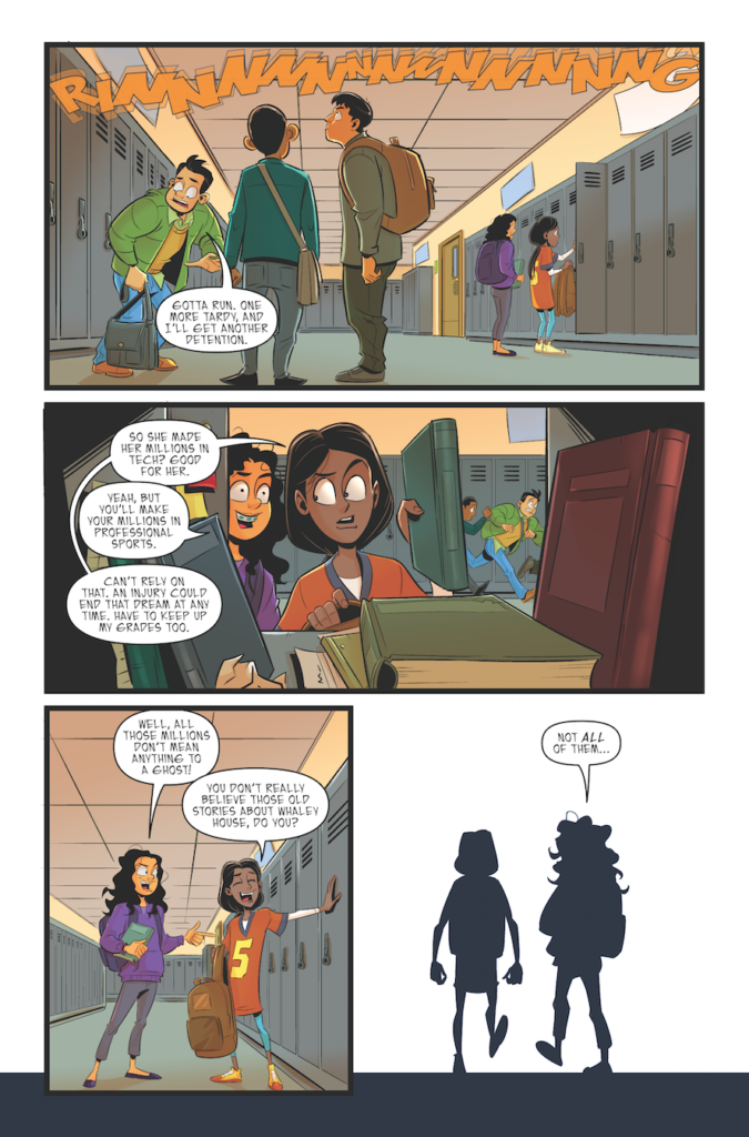
Goosebumps: Horror of the Witch House
“Christa Miesner’s lettering is effective with easy-to-follow key elements that are appealing to the target demographic. “
-Wenxian Tan, Fanbase Press
Read Only Memories
Napoleon Dynamite
“Monlongo’s art, accompanied by Christa Miesner’s lettering, fits the style of this story perfectly in its own quirkiness”
-Eric Parrish, Comic Book Corner, Geekmom.com